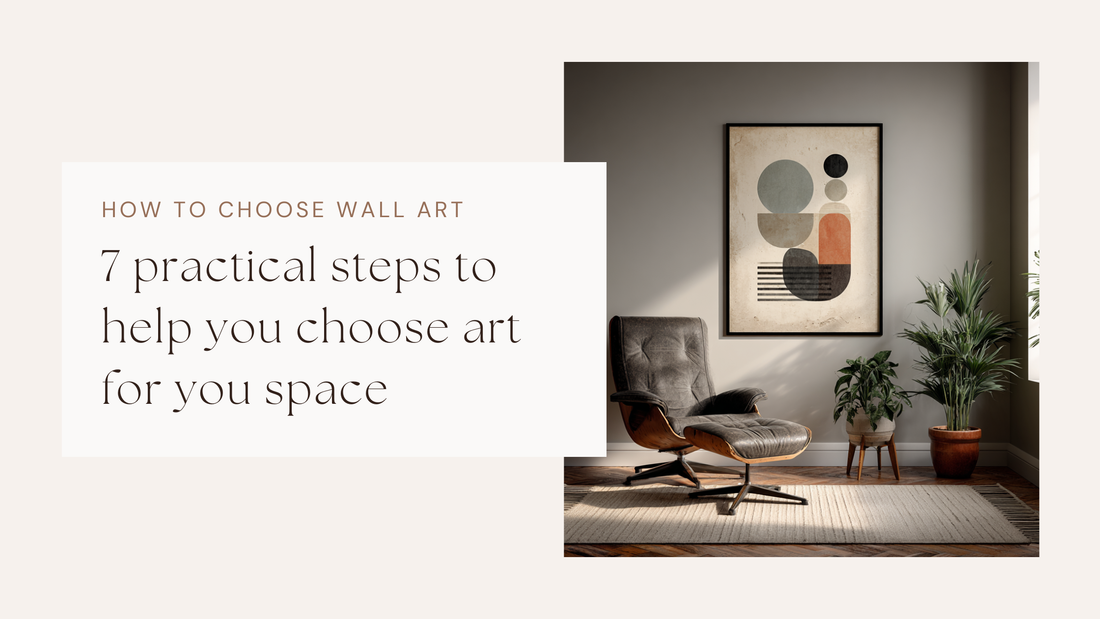
How to Choose Wall Art
Jack CyphusChoosing wall art can be a tricky situation for a lot of people, especially with the mountains of mass-produced prints available on places like Temu and Amazon — but don’t fear! This guide will help you figure out what you and your walls actually need.
In a nutshell, you should consider the mood and purpose of the room you’re buying for. Measure the wall or furniture and aim for artwork that spans about two-thirds of that width — this is called the “two-thirds rule,” but we’ll get into that later. Pick a palette that either complements or contrasts your décor, and choose a layout (single statement, grid, diptych/triptych, or gallery wall). Then frame and hang your art at eye level, around 145–152 cm from the floor to the centre.
With the advancement of technology, you can also preview how it might look using AI generation — but that’s a guide for another time.
How to Choose Wall Art: a 7-step checklist
1. Start with the purpose and mood
This is an important part of the planning process when deciding on your artwork. Is it a calm bedroom, a lively kitchen with little ones running around, or are you looking to centre around a hyper-focused office? These questions are the first step to determining what kind of art you want. Pick subjects and palettes that support the vibe you want from your room and how you want to feel: pastel-coloured landscapes could offer serenity, while contrasted abstract geometrics can give energy. So deciding the purpose and mood of your art will enable you to look for styles, colours and subjects.
2. Pick a layout that fits your space
Every space is different. Some will require a single poster to balance a room, and another may require multiple. Once you have decided on the mood, you can then decide on the wall or location intent. Single statement pieces can simplify things, grids can feel more tailored or calm, gallery walls can add a personality to a space that speaks for itself, and diptychs/triptychs stretch across long spans to give you something to think about.
Mirrors, ornaments and textured fabrics can help to break up repetition and bounce light.
3. Measure before you buy
Posters and wall art come in all shapes and sizes, and that feeling when your new piece arrives — you’re anxious to open it up and see it in real life — but then realise it’s the wrong size, is not a feeling any of us like. If you know where you’re putting your art, be sure to grab a tape measure and visualise it first.
For a single piece above furniture, target roughly two-thirds of the furniture width and hang 20–25 cm above the back of the sofa or headboard. For empty walls, the same two-thirds guideline keeps proportions balanced.
4. Choose a colour strategy
I understand that most of us are not interior designers, and colour contrasting or complementing is not the easiest task. To help think about things more clearly, decide whether you will blend (pull two or three hues from the room’s textiles or decor) or contrast (introduce one accent that lifts everything). It’s a good idea to repeat that accent at least twice in the room so it feels intentional and not out of place.
I am curating colour palette collections and designing posters for colour matching to make it easier for people to find relatable artworks to match together or with your room. Be sure to sign up to my newsletter to stay up to date.
5. Medium and finish
It’s safe to say that I am a poster fan, but honestly posters are not always the number one choice. Posters and prints can feel crisp, but sometimes they need to be complemented with a frame. Canvas can add warmth to a room with its textured finish, and if you are feeling even more adventurous, textiles, plates and reliefs can add texture and depth that frames cannot.
6. Framing
So let’s talk about framing. Frames need to be considered carefully, especially these days as they come in all sorts of colours, materials and styles. The way to choose a frame is similar to the way you choose your art. Depending on the mood and purpose, you should select a frame to complement the desired outcome. For example, black frames can sharpen, pale wood frames can soften, and brass frames can warm. Mixing frames is fine also, but too many can start to look a little messy.
7. Preview, adjust and hang
Test with kraft-paper cutouts or quick AI mock-ups (details below), check sightlines from seating, and only then commit.
Room-by-room layout ideas (for all kinds of homes)
Super! Now you have a nice simple way to determine the artwork that may be suitable for the personality and feel you want, so let’s make it even easier to decide on wall art based on specific rooms.
The Living Room
This room is all about balance not size. Whether you have a spacious open-plan setup or a small cosy apartment corner, balance is the key. Larger rooms can handle a bold statement piece or a wide grid layout, whereas smaller spaces often look better with one or two centred prints. If your room is already feeling a little bit busy or full of furniture, then it would be wise to go for art with some breathing space — neutral backgrounds or softer tones can help calm visual noise. If you have minimal clutter, you can go louder with contrast or scale. Remember earlier when I said mirrors, textile hangings, sculptures and plants can help to reflect light and add depth? This could be handy in a living room for sure.
Ah, the Bedroom
A calm space for us all, but calm can mean different things to different people. For some, that’s muted abstracts and soft botanicals; for others, absolute maximalism. Wherever your calm may be, it is important to remember that if you share the room, then strike a balance between styles, and your layout should reflect this. Whether the room is large or compact, keep art above the headboard around two-thirds of its width and about 20–25 cm above it for the best proportion.
Dining Room
An area best known for food and conversation, a place to bring people together. These rooms work best with art that feels more conversational and unassuming. You don’t want to be overwhelmed whilst eating your fish fingers. These rooms often benefit from a small amount of carefully placed posters. Avoid glossy finishes facing windows — they’ll catch glare during daylight meals.
Hallways and Stairs
These are the in-between spaces where art does most of the personality work. Narrow hallways? Use a sequence of small portrait prints or a slim vertical gallery strip. Larger ones can host an asymmetrical mix to create movement. For staircases, align artwork with the pitch of the stairs rather than trying to keep frames level with the floor — it flows more naturally, especially in homes with changing light or angles.
Kitchen and Bathroom
These rooms can be tricky because of moisture, heat and clutter. Go for sealed frames, metal prints, or textiles that won’t warp. In smaller kitchens, keep pieces small and focused — think prints above coffee stations or between cabinets. In larger, open-plan kitchens, treat one wall like a casual gallery. Bathrooms benefit from texture: woven hangings, small ceramic plates or embossed reliefs bring warmth where paper prints might struggle.
Sizing rules that save you returns
| The two-thirds rule | Hanging height | Spacing |
|---|---|---|
| Art should span about 66% of the furniture or wall width. It works for single pieces and for grouped artworks measured edge-to-edge. | Centre at roughly 145–152 cm from the floor (57–60 in) in most homes, with exceptions over furniture and mantels. | Leave 5–8 cm between frames in a grid; 5–12 cm on gallery walls depending on piece size; keep top or midlines consistent so the grouping reads as one unit. |
When to choose statement, grid, diptych, gallery wall or “not a frame”
Single statement
Best for small rooms or when you want calm. Choose a bolder scale and simpler composition.
Grid
Diptych/Triptych
Gallery wall
Beyond frames
Murals, textiles, cross-stitch, plates, and carved reliefs add depth and story, especially where texture matters — bathrooms, stairwells, or cosy corners. Think about statement without adding bulk to the room.
Choosing the right art for your space
Choosing the right art for your space isn’t about following an exact set of rules. It depends on the space you have — physically, I mean — the personality you want, and the mood you’re after. I hope this guide helps with some practical tips to consider, but remember: if you like it, that’s the absolute most important thing!
Don’t forget to sign up for my newsletter to stay up to date with all the beautiful things coming to Artifficial Pixels, including colour-palette-specific and stylised poster collections.

Blush Medina Poster and Print Collection – Mediterranean Pastel Wall Art
Explore Blush Medina. A collection of digital art prints built from a Mediterranean-inspired palette of pastel pinks and greys, muted orange, soft silver and artichoke green. Perfect for living rooms, kitchens and calm spaces — sun-washed colour that’s easy to style and easy to live with.